상호작용을 위한 몇가지 기능
익숙하고 일관적인 디자인을 위해 애플에서 제공하는 몇가지 기능들이 있습니다
- Widgets
- Home Screen quick actions
- Spotlight
- Shortcuts
- Activity views
Widgets
A widget elevates a small amount of timely, personally relevant information from your app or game, displaying it where people can see it at a glance.
위젯은 적절한 시간에 소량의 정보를 끌어올려 사람들이 한눈에 볼 수 있도록 표시합니다
Even though interacting with a widget lets people see or do more in your app, a widget’s main purpose is to provide useful content people can get without opening your app
위젯을 사용하더라도 앱을 통해 더 많은 정보를 볼 수 있도록 할 수 있지만 위젯의 주요 목적은 앱을 실행시지 않아도 유용한 정보를 제공하는 것입니다
Useful and delightful, widgets can also help people make their devices more personal. For developer guidance, see Creating a widget extension.
유용하고 유쾌한 위젯은 기기를 더욱 개인화 시키는데 도움이 됩니다. 개발자 가이드라인은 이곳을 참조하세요
Widgets can be small, medium, large, and — in iPadOS only — extra large. In iOS and iPadOS, widgets appear on the Home Screen or in Today View; in macOS, Notification Center displays widgets.
위젯은 small, medium, large, extra large(iPad 전용)으로 구분됩니다. iOS와 iPadOs에서 위젯은 홈화면과 Today View에서만 나타납니다. macOS에서는 알림센터에서 위젯을 표시합니다
The widget gallery — available in Today View and Home Screen editing mode in iOS and iPadOS, and Notification Center editing mode in macOS — helps people find the widgets they want in the sizes that work for them.
위젯 갤러리는 사용자가 자신에게 적절한 사이즈의 위젯을 찾는데 도움을 줍니다
(iOS, iPadOS에서는 홈화면, Today View의 editing 모드에서 , macOS에서는 알림센터의 editing모드에서 사용가능)
The gallery’s editing mode lets people make changes to editable widgets, such as changing the location in a Weather widget or selecting a topic in a News widget
갤러리 editing모드를 통해 사용자는 설정가능한 위젯을 수정할 수 있습니다.
(날씨위젯에서 지역을 변경하거나 뉴스위젯에서 주제를 변경하는것과 같은 일)
In iOS and iPadOS, the widget gallery also supports widget stacks, including a Smart Stack. A stack contains up to 10 same-size widgets; people view one widget at a time by scrolling through the stack.A Smart Stack automatically rotates through the stack of widgets, displaying the widget most likely to be relevant in the current context
iOS와 iPadOS의 위젯 갤러리에서는 Smart Stack을 포함한 위젯 스택을 지원합니다. 동일한 크기의 위젯을 최대 10개까지 스택을 쌓을 수 있습니다. 사람들은 스택을 스크롤링하며 하나의 위젯만을 볼 수 있습니다
Smart Stack은 자동으로 회전하며 현재 가장 관련성 높은 위젯을 표시합니다
Siri can add a suggested widget to the Smart Stack when it’s likely that people are interested in it. A suggested widget doesn’t stay in the Smart Stack unless people choose to keep it. For developer guidance, see Increasing the visibility of widgets in Smart Stacks.
시리는 사용자가 흥미를 가질만한 위젯을 Smart Stack에 자동으로 위젯을 추가하여 제안할 수 있습니다. 제안된 위젯은 사용자가 킵하지 않으면 유지되지 않습니다 (자동으로 사라짐). 개발자 가이드라인은 이 곳을 참고
모범사례
The first step in the design process is to choose a single idea for your widget. Throughout the process, use that idea to keep the widget’s content focused and relevant
디자인 프로세스의 첫 번째 단계는 위젯에 대한 단일 아이디어를 선택하는 것입니다. 프로세스 전반에 걸쳐 해당 아이디어를 사용하여 위젯의 콘텐츠에 초점을 맞추고 관련성을 유지하세요.
Look for a simple idea that’s clearly related to your app’s main purpose
간단한 아이디어와 명확한 앱의 목적을 찾으세요
In some cases, this idea might mean choosing an idea that resembles your app’s overall purpose
경우에 따라 이 아이디어는 앱의 전반적인 목적과 유사한 아이디어를 선택하는 것을 의미할 수 있습니다
For example, a weather app’s widget could show the weather for a single location, or the widget for a calorie-tracking app might show calories burned for the day.
에를 들어, 날씨앱의 위젯은 한 곳의 날씨만 표시하거나 칼로리측정 앱은 하루에 소비한 칼로리를 표시하는 경우가 있습니다
In other cases, a widget’s idea can reflect an aspect of the app’s main purpose
다른경우, 위젯 아이디어가 앱의 주요목적에 반영될 수 있습니다(?)
For example, a game’s widget could show a character’s status, or the widget from a drawing app might display favorite sketches
예를 들어, 게임 위젯은 캐릭터의 상태를 표시할 수 있고 스케치앱은 가장 좋아하는 스케치를 표시할 수 있습니다
In each size, display only the information that’s directly related to the widget’s idea
위젯의 각 사이즈는 직접적으로 관련있는 것만 표시해야 합니다
In larger widgets, you can display more data — or more detailed visualizations of the data — but it’s crucial to stay focused on the widget’s idea.
큰 사이즈의 위젯은 더많은 데이터, 상세한 시각화된 데이터 를 표시할 수 있습니다. 하지만 위젯의 아이디어에 집중할 필요가 있습니다
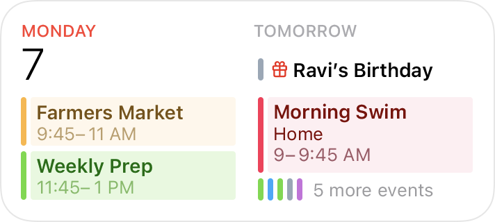
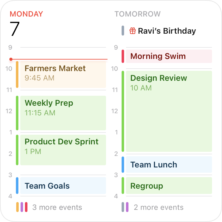
For example, all Calendar widgets display the user’s upcoming events
예를들어, 캘린더는 사용자의 예정된 이벤트르 표시합니다
In each size from small to extra large, the widget maintains its focus on events while expanding the range of information as the size increases.
small 부터 large사이즈까지 각 위젯들은 이벤트에 초점을 초점을 맞추어 정보를 점차 확장해 나갑니다

-Avoid creating a widget that only launches your app.
앱을 실행만하는 위젯은 만들지 말아야 합니다
People appreciate widgets because they provide instant access to meaningful content. A widget that behaves like an app icon offers no additional value and isn’t likely to remain on the screen.
사람들은 의미있는 컨텐츠를 표시하는 위젯을 높히 평가합니다. 앱 아이콘과 같은 위젯은 추가 가치가 없으며 화면에 남아 있지 않을 것입니다.
-Offer your widget in multiple sizes when doing so adds value
더 많은 정보를 제공할 필요가 있을 때 다양한 사이즈를 제공하세요
In general, avoid simply expanding a smaller widget’s content to fill a larger area.
단순히 작은 위젯에서 단순히 크기만 확장시키지 말아야 합니다
It’s more important to create one widget in the size that works best for the content you want to display than it is to provide the widget in all sizes.
표시하려는 컨텐츠에서 가정 적절한 사이즈의 위젯을 선택하는 것이 더욱 중요합니다
-Prefer dynamic information that changes throughout the day
하루종일 갱신되는 동적인 정보가 선호됩니다
If a widget’s content never appears to change, people may not keep it in a prominent position
위젯의 컨텐츠가 전혀 바뀌지 않는다면 위젯은 눈에 띄는 자리를 유지할 수 없습니다.
Although widgets don’t update from minute to minute, it’s important to find ways to keep their content fresh to invite frequent viewing.
n분단위로 업데이트되지 않더라도 위젯은 자주볼 수 있도록 컨텐츠를 최신상태로 유지하는것이 중요합니다
-Look for opportunities to surprise and delight
놀라움과 기쁨을 줄 수 있는 기회를 찾으세요
For example, you might design a unique visual treatment for your calendar widget to display on meaningful occasions, like birthdays or holidays
예를 들어, 생일이나 기념일과 같이 의미있는 날은 캘린더 위젯이 특별한 시각처리를 할 수 있도록 디자인합니다

Updating widget content 위젯 내용 업데이트
To remain relevant and useful, widgets periodically refresh their information. Widgets don’t support continuous, real-time updates, and the system may adjust the limits for updates depending on various factors
관련성, 유용성을 유지하기 위해 위젯은 주기적으로 정보를 새로고침 해야합니다. 위젯은 실시간으로 업데이트할 수 없으며 시스템의 여러 요인으로 인해 업데이트제한을 조정할 수 있습니다
Keep your widget up to date.
위젯을 최신상태로 유지하기
Finding the appropriate update frequency for your widget depends on knowing how often the data changes and estimating how often people need to see new data. For example, a widget that helps people track tides at a beach could provide useful information on an hourly basis, even though tide conditions change constantly.
위젯을 업데이트하는 적절한 주기를 알아내는 방법은 데이터가 얼마나 자주 업데이트되고 새로운 데이터를 볼 필요가 있는 빈도를 추정해야 합니다.
If people are likely to check your widget more frequently than you can update it, consider displaying text that describes when the data was last updated. For developer guidance, see Keeping a widget up to date.
만약 사람들이 위젯을 업데이트하는것 보다 더 자주 확인한다면 화면에 최근 업데이트된 시간을 설명하는 텍스트를 포함하는것이 좋습니다.
Let the system update dates and times in your widget
시스템이 날짜,시간을 업데이트 하도록 할 것
Widget update frequency is limited, and you can preserve some of your update opportunities by letting the system refresh date and time information.
위젯을 업데이트할 수 있는 빈도는 제한되어 있습니다. 시스템이 날짜, 시간을 업데이트하면서 위젯을 업데이트할 수 있는 기회를 유지할 수 있습니다.
Show content quickly.
컨텐츠를 빠르게 확인할 수 있도록 할 것
When you determine the update frequency that fits with the data you display, you don’t need to hide stale data behind placeholder content
화면에 표시할 데이터에 맞는 업데이트 빈도를 결정할 때, placeholder뒤에 오래된 데이터를 숨길필요가 없습니다.
Interactivity 상호작용
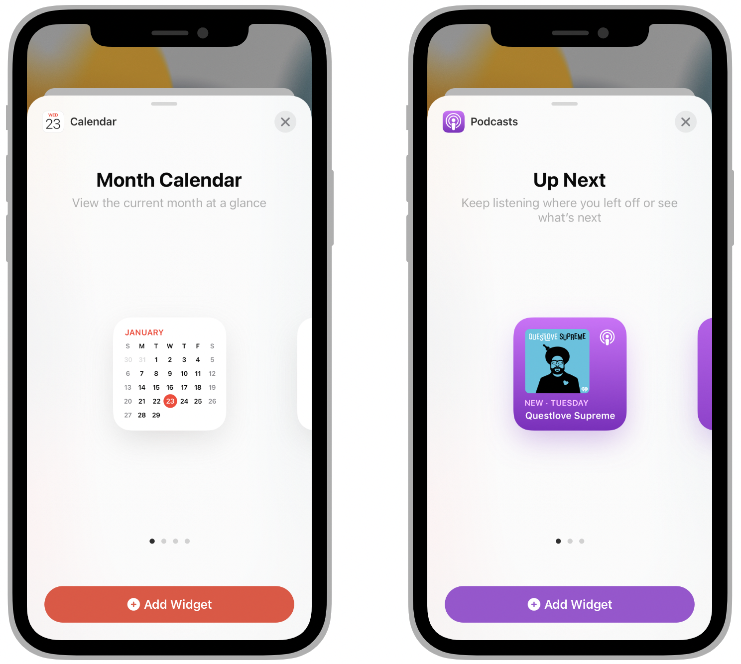
In some cases, people need to edit a widget to ensure it displays the information that’s most useful for them. For example, people choose a stock symbol for a Stocks symbol widget. In contrast, some widgets — like the Podcasts widget — automatically display recent content, so people don’t need to customize them.
어떤경우에는 가장 유용한 정보를 표시할 수 있도록 사람이 편집할 수 있어야 합니다. 예를들어, 주식위젯이라면 사람이 원하는 주식 종목을 선택할 수 있어야 합니다. 대조적으로 팟캐스트와 같은 위젯은 가장 최신의 컨텐츠를 자동으로 표시해야 하므로 사용자가 커스텀하지 않습니다.
Make editable widgets easy for people to customize.
사용자가 쉽게 커스텀할 수 있는 위젯을 만들자
If your widget is editable, avoid requiring too many settings or asking for information that might be hard for people to find. You don’t have to design an editing-mode user interface for your widget because the system automatically generates it for you. For developer guidance, see Making a configurable widget.
편집할수 있는 위젯이라면, 너무 많은 설정 또는 찾기 어려운 정보를 요구하지 마세요. 시스템이 editing모드를 자동으로 생성해 주기 때문에 따로 디자인할 필요가 없습니다.
Ensure that a widget interaction opens your app at the right location.
위젯과 상호작용할 때 앱의 올바른 위치로 연결되는지 확인할 것
When people interact with your widget, it deep links into your app, where you can offer details and actions that directly relate to the widget’s content.
사람들이 위젯과 상호작용할 때, 위젯컨텐츠와 직접 관련된 세부정보 및 작업을 제공할 수 있는 앱으로 앱과 딥링크 됩니다.
Avoid making people navigate to the relevant area.
사람들이 관련된 지역으로 이동하는것을 피하세요 (???)
For example, when people click or tap a Stocks Symbol widget, the Stocks app opens to a page that displays information about that symbol.
예를들어, 사람들이 주식 위젯을 누르면, 주식앱이 열리며 해당 주식에 대한 정보를 표시하는 페이지로 이동합니다
Similarly, when people click or tap a small Stocks Watchlist widget, the app opens to show the complete watchlist. When people click or tap one symbol in a larger version of the Watchlist widget, Stocks open to show that symbol.
이와 유사하게, 사람들이 small사이즈의 주식앱의 '나의종목' 위젯을 누르면 전체 '나의종목' 리스트를 확인할 수 있는 곳으로 앱이 열립니다. 더 큰 (medium 이상의)위젯의 경우 해당 종목만 볼 수 있도록 주식앱이 열립니다
정리: 아이폰의 기본앱인 주식을 예로 든것. 주식위젯은 내가 저장한 '나의종목'의 상위 리스트를 위젯에 표시해 줍니다
small사이즈의 위젯은 어디를 누르던 모든 종목을 확인하는 '나의종목'으로 이동되고 이보다 큰 medium, large 인 경우 터치한 종목의 디테일한 정보를 보여주는 화면으로 이동된다.
Avoid defining too many interaction targets.
너무 많은 상호작용 타겟을 정의하지 마세요
A small widget supports a single target, but larger widgets can offer multiple targets.
small사이즈의 위젯은 하나의 target만 제공하지만 이보다 큰 경우 여러target을 만들 수 있습니다
For example, the medium Notes widget can display several notes. When people click or tap one of them, the app opens to display that note.
예를들어, medium 메모 위젯은 3개의 메모를 화면에 띄우며 그 중 하나를 눌렀을 때 해당 메모로 이동합니다
Although multiple interaction targets might make sense for your content, avoid offering so many that people have to spend time choosing the one they want.
많은 상호작용 target이 컨텐츠에 적합할 수 있지만 사람들이 원하는target을 선택하는데에 너무 많은 시간을 소비하게 하지 마세요
Let people know when authentication adds value.
인증이 필요한 경우 사용자에게 알리세요
If your widget provides additional functionality when someone is signed in to your app, make sure people know that.
만약 앱에 사용자가 로그인했을 경우 추가적인 기능을 제공하는 위젯이라면 사용자에게 알려야 합니다.
For example, an app that shows upcoming reservations might include a message like “Sign in to view reservations” when people are signed out.
예를들어, 예약을 표시하는 앱이라면 사용자가 로그아웃했을 때, "예약을 보려면 로그인하세요"같은 메시지를 포함해야 합니다.
Interface design 인터페이스 디자인
Widgets use vivid colors, rich images, and clear, crisp text that’s easy to read at a glance. A unique, beautiful widget not only provides useful information, it also can encourage people to feature it on their devices.
위젯은 선명한 색상, 풍부한 이미지, 한 눈에 읽기 쉬운 명확하고 선명한 텍스트를 사용합니다. 독특하고 아름다운 위젯은 유용한 정보를 제공할 뿐만 아니라 사람들이 자신의 기기에서 해당 위젯을 표시하도록 권장할 수 있습니다.
Help people recognize your widget by including design elements linked to your brand’s identity.
브랜드 아이덴티티와 연결된 디자인 요소를 포함해 사람들이 위젯을 인식할 수 있도록 하세요
Design elements like brand colors, typeface, and stylized glyphs can make a widget instantly recognizable. Take care to keep brand-related design elements from crowding out useful information or making your widget look out of place on the Home Screen.
브랜드 색상, 서체 및 스타일화된 글리프와 같은 디자인 요소를 사용하면 위젯을 즉시 알아볼 수 있습니다. 브랜드 관련 디자인 요소가 유용한 정보를 뭉개거나 위젯이 홈 화면에서 어울리지 않게 보이지 않도록 주의하세요.
NOTE
When a widget appears in Notification Center in iOS and macOS or on the Home Screen in iOS, the system displays the app name below it. In Notification Center or the Home Screen in iPadOS, the app name doesn’t appear below a widget.
iOS 및 macOS의 알림 센터 또는 iOS의 홈 화면에 위젯이 나타나면 시스템은 그 아래에 앱 이름을 표시합니다. 알림 센터 또는 iPadOS의 홈 화면에서 위젯 아래에 앱 이름이 표시되지 않습니다.
Consider carefully before displaying a logo, wordmark, or app icon in your widget.
위젯에 로고, 워드마크 또는 앱 아이콘을 표시하기 전에 신중하게 고려하십시오
When you include brand-related design elements like colors and fonts, people seldom need your logo or app icon to help them recognize your widget.
색상 및 글꼴과 같은 브랜드 관련 디자인 요소를 포함하면 사람들이 위젯을 인식하는 데 도움이 되는 로고나 앱 아이콘이 거의 필요하지 않습니다
Also, the widget gallery displays your app name and icon when it lists the various types and sizes of widgets you offer.
또한 위젯 갤러리에는 제공하는 다양한 유형과 크기의 위젯이 나열될 때 앱 이름과 아이콘이 표시됩니다
In some widgets — for example, those that display content from multiple sources — it may make sense to include a small logo in the top-right corner to subtly identify the app that provides the widget.
일부 위젯(예: 여러 소스의 콘텐츠를 표시하는 위젯)에서는 위젯을 제공하는 앱을 미묘하게 식별하기 위해 오른쪽 상단 모서리에 작은 로고를 포함하는 것이 합리적일 수 있습니다.
Aim for a comfortable density of information.
편안한 정보 밀도를 목표로 합니다
When content appears sparse, the widget can seem unnecessary;
콘텐츠가 희박하게 나타나면 위젯이 불필요해 보일 수 있습니다. 콘텐츠가 너무 조밀하면 위젯을 한눈에 볼 수 없습니다.
when content is too dense, the widget isn’t glanceable. If you have lots of information to include, avoid letting your widget become a collage of items that are difficult to parse.
포함할 정보가 많은 경우 위젯이 구문 분석하기 어려운 항목의 콜라주가 되도록 하지 마십시오.
Seek ways to curate the content so that people can grasp the essential parts instantly and view relevant details at a longer look.
사람들이 핵심적인 부분을 즉시 파악하고 관련 세부 사항을 더 길게 볼 수 있도록 콘텐츠를 선별하는 방법을 찾으십시오.
You might also consider creating a larger widget and looking for places where you can replace text with graphics without losing clarity.
더 큰 위젯을 만들고 선명도를 잃지 않고 텍스트를 그래픽으로 바꿀 수 있는 위치를 찾는 것도 고려할 수 있습니다.
Use color judiciously.
색상을 신중하게 사용하십시오
Beautiful colors draw the eye, but they’re best when they don’t prevent people from absorbing a widget’s information at a glance.
아름다운 색상이 시선을 끌지만 위젯의 정보를 한눈에 흡수하는 것을 방해하지 않을 때 가장 좋습니다.
Use color to enhance a widget’s appearance without competing with its content. In your asset catalog, you can also specify the colors you want the system to use as it generates your widget’s editing-mode user interface.
색상을 사용하여 내용과 경쟁하지 않고 위젯의 모양을 향상시킵니다. 자산 카탈로그에서 시스템이 위젯의 편집 모드 사용자 인터페이스를 생성할 때 사용할 색상을 지정할 수도 있습니다.
Support Dark Mode.
다크모드 지원하기
Ideally, a widget looks great in both the light and dark appearances. In general, avoid displaying dark text on a light background for the dark appearance, or light text on a dark background for the light appearance.
이상적으로 위젯은 밝고 어두운 모양 모두에서 멋지게 보입니다. 일반적으로 어두운 모양을 위해 밝은 배경에 어두운 텍스트를 표시하거나 밝은 모양을 위해 어두운 배경에 밝은 텍스트를 표시하지 마십시오.
When you use the semantic system colors for text and backgrounds, the colors dynamically adapt to the current appearance.
텍스트와 배경에 의미 체계 색상을 사용하면 색상이 현재 모양에 동적으로 적응합니다.
You can also support different appearances by putting color variants in your asset catalog. For guidance, see Dark Mode; for developer guidance, see About asset catalogs.
자산 카탈로그에 색상 변형을 넣어 다양한 모양을 지원할 수도 있습니다. 지침은 다크 모드 를 참조하십시오 . 개발자 지침은 자산 카탈로그 정보 를 참조하십시오 .
Consider using SF Pro.
SF Pro 사용을 고려하십시오 (글꼴)
Using the system font helps your widget look at home on any platform, while making it easier for you to display great-looking text in a variety of weights, styles, and sizes.
시스템 글꼴을 사용하면 위젯이 모든 플랫폼에서 집처럼 보이게 하는 동시에 다양한 두께, 스타일 및 크기의 멋진 텍스트를 더 쉽게 표시할 수 있습니다
If you need to use a custom font, consider using it sparingly, and be sure it’s easy for people to read at a glance.
사용자 정의 글꼴을 사용해야 하는 경우 사용을 최소화하고 사람들이 한 눈에 읽기 쉬운 글꼴인지 확인합니다
It often works well to use a custom font for the large text in a widget and SF Pro for the smaller text. For guidance, see Typography.
위젯의 큰 텍스트에는 사용자 정의 글꼴을 사용하고 작은 텍스트에는 SF Pro를 사용하는 것이 좋습니다. 지침은 타이포그래피 를 참조하십시오
Avoid using very small font sizes.
너무 작은 사이즈의 폰트는 피할것
In general, display text using fonts at 11 points or larger. Text in a font that’s smaller than 11 points can be too small for most people to read at a glance.
일반적으로 11포인트 이상의 글꼴을 사용하여 텍스트를 표시합니다. 11포인트보다 작은 글꼴의 텍스트는 대부분의 사람들이 한 눈에 읽기에는 너무 작을 수 있습니다.
Always use text elements in a widget to ensure that your text scales well.
항상 위젯에서 텍스트 요소를 사용하여 텍스트가 잘 확장되도록 할것
In particular, don’t rasterize text — doing so prevents VoiceOver from speaking your content.
특히 텍스트를 래스터화하지 마십시오. 그렇게 하면 VoiceOver가 콘텐츠를 말하는 것을 방지할 수 있습니다.
Consider using SF Symbols.
SF 심볼사용을 고려할것
SF Symbols helps you align and scale symbols with text that uses SF Pro. For guidance, see SF Symbols.
SF 기호를 사용하면 SF Pro를 사용하는 텍스트에 기호를 정렬하고 크기를 조정할 수 있습니다.
Design a realistic preview to display in the widget gallery.
위젯 갤러리에 표시할 사실적인 미리보기를 디자인합니다
Highlighting your widget’s capabilities — and clearly representing the experiences each widget type or size can provide — helps people make an informed decision. You can display real data in your widget preview, but if the data takes too long to generate or load, display realistic simulated data instead.
위젯의 기능을 강조 표시하고 각 위젯 유형 또는 크기가 제공할 수 있는 경험을 명확하게 나타내면 사람들이 정보에 입각한 결정을 내리는 데 도움이 됩니다. 위젯 미리보기에 실제 데이터를 표시할 수 있지만 데이터를 생성하거나 로드하는 데 시간이 너무 오래 걸리는 경우 대신 사실적인 시뮬레이션 데이터를 표시하십시오.
Design placeholder content that helps people recognize your widget.
사람들이 위젯을 인식하는 데 도움이 되는 placeholder 콘텐츠를 디자인합니다
An installed widget displays placeholder content while its data loads. You can create an effective placeholder appearance by combining static parts of the user interface with semi-opaque shapes that stand in for actual content. For example, you can use rectangles of different widths to suggest lines of text, and circles or squares in place of glyphs and images.
설치된 위젯은 데이터가 로드되는 동안 자리 표시자 콘텐츠를 표시합니다. 사용자 인터페이스의 정적 부분을 실제 콘텐츠를 나타내는 반투명 모양과 결합하여 효과적인 자리 표시자 모양을 만들 수 있습니다. 예를 들어 너비가 다른 사각형을 사용하여 텍스트 줄을 제안하고 글리프 및 이미지 대신 원이나 사각형을 제안할 수 있습니다.
Avoid mirroring your widget’s appearance within your app.
앱 내에서 위젯의 모양을 미러링하지 마십시오
If your app displays an element that looks like your widget but doesn’t behave like it, people can be confused when the element responds differently when they interact with it. Also, people may be less likely to try other ways to interact with such an element in your app because they expect it to behave like a widget.
앱이 위젯처럼 보이지만 그렇게 동작하지 않는 요소를 표시하는 경우 요소와 상호 작용할 때 요소가 다르게 반응할 때 사람들이 혼동할 수 있습니다. 또한 사람들은 앱에서 이러한 요소가 위젯처럼 작동할 것으로 기대하기 때문에 앱에서 이러한 요소와 상호 작용하기 위해 다른 방법을 시도할 가능성이 낮을 수 있습니다.
Write a succinct description of your widget.
위젯에 대한 간단한 설명을 작성하세요
The widget gallery displays descriptions that help people understand what each widget does. It generally works well to begin a description with an action verb — for example, “See the current weather conditions and forecast for a location” or “Keep track of your upcoming events and meetings.” Avoid including unnecessary phrases that reference the widget itself, like “This widget shows...,” “Use this widget to...,” or “Add this widget.” Use approachable language and sentence-style capitalization.
위젯 갤러리는 사람들이 각 위젯이 하는 일을 이해하는 데 도움이 되는 설명을 표시합니다. 일반적으로 동작 동사로 설명을 시작하는 것이 좋습니다. 예를 들어 "현재 날씨 상태 및 위치 예측 보기" 또는 "예정된 이벤트 및 회의를 추적하세요." "이 위젯은...", "이 위젯을 사용하여..." 또는 "이 위젯 추가"와 같이 위젯 자체를 참조하는 불필요한 문구를 포함하지 마십시오.
접근하기 쉬운 언어와 문장 스타일의 대문자 를 사용하세요 .
Group your widget’s sizes together, and provide a single description.
위젯의 크기를 그룹화하고 단일 설명을 제공합니다
If your widget is available in multiple sizes, group the sizes together so people don’t think each size is a different widget. Provide a single description of your widget — regardless of how many sizes you offer — to avoid repetition and to help people understand how each size provides a slightly different perspective on the same content and functionality.
위젯이 여러 크기로 제공되는 경우 사람들이 각 크기가 다른 위젯이라고 생각하지 않도록 크기를 함께 그룹화합니다. 제공하는 크기에 관계없이 위젯에 대한 단일 설명을 제공하여 반복을 피하고 사람들이 각 크기가 동일한 콘텐츠 및 기능에 대해 약간 다른 관점을 제공하는 방식을 이해하도록 돕습니다.
Consider coloring the Add button.
추가버튼에 색을 추가할것을 고려할 것
After people choose your app in the widget gallery, an Add button appears below the group of widgets you offer. You can specify a color for this button to help remind people of your brand.
사람들이 위젯 갤러리에서 앱을 선택하면 제공하는 위젯 그룹 아래에 추가 버튼이 나타납니다. 이 버튼의 색상을 지정하여 사람들에게 브랜드를 상기시킬 수 있습니다.
Adapting to different screen sizes 다양한 화면크기에 대응
Widgets scale to adapt to the screen sizes of different devices and onscreen areas. Ensure that your widget looks great on every device by supplying content at appropriate sizes.
위젯은 다양한 장치 및 화면 영역의 화면 크기에 맞게 조정됩니다. 적절한 크기의 콘텐츠를 제공하여 위젯이 모든 기기에서 멋지게 보이도록 하세요.
Design content to look great on all devices and scale factors, letting the system resize or scale as necessary.
모든 장치와 배율 요소에서 멋지게 보이도록 콘텐츠를 디자인하여 시스템이 필요에 따라 크기를 조정하거나 확장할 수 있습니다
In iOS, the system ensures that your widget looks good on small devices by resizing the content you design for large devices.
iOS에서 시스템은 디자인한 콘텐츠의 크기를 큰 기기에 맞게 조정하여 위젯이 작은 기기에서도 잘 보이도록 합니다
In iPadOS, the system renders your widget at a large size before scaling it down for display on the Home Screen.
iPadOS에서 시스템은 홈 화면에 표시하기 위해 축소하기 전에 위젯을 큰 크기로 렌더링합니다.
As you create design comprehensives for various devices and scale factors, use the values listed in Specifications for guidance; for your production widget, use SwiftUI to ensure flexibility.
다양한 장치 및 축척 요소에 대한 포괄적인 설계를 생성할 때 사양 에 나열된 값 을 지침으로 사용하십시오. 프로덕션 위젯의 경우 SwiftUI 를 사용하여 유연성을 보장하십시오. (??)
Coordinate the corner radius of your content with the corner radius of the widget.
콘텐츠의 radius를 위젯의 radius로 조정합니다
To ensure that your content looks good within a widget’s rounded corners, use a SwiftUI container to apply the correct corner radius. For developer guidance, see ContainerRelativeShape.
위젯의 둥근 모서리 내에서 콘텐츠가 잘 보이도록 하려면 SwiftUI 컨테이너를 사용하여 올바른 radius를 적용하십시오.
NOTE
In iOS, widgets support Dynamic Type sizes from Large to AX5 when you use Font to choose a system font or custom(_:size:) to choose a custom font.
iOS에서 위젯은 글꼴 을 사용 하여 시스템 글꼴을 선택하거나 custom(_:size:) 을 사용하여 사용자 정의 글꼴을 선택할 때 Large에서 AX5까지의 동적 유형 크기 를 지원 합니다.
In general, use standard margins to ensure your content is comfortably legible.
일반적으로 콘텐츠를 편안하게 읽을 수 있도록 표준 여백을 사용합니다
The standard margin width is 16 points. If your widget displays content like text, glyphs, and graphs, use the standard margins to avoid crowding the edges and creating a cluttered appearance. For developer guidance, see padding(_:_:). If you use background shapes to create visual content groupings, or if you display button backgrounds, you might need to use tight margins. Tight margins — which measure 11 points in width — can also help make graphics that contain information easier for people to read.
표준 여백 너비는 16포인트입니다. 위젯에 텍스트, 글리프 및 그래프와 같은 콘텐츠가 표시되는 경우 표준 여백을 사용하여 가장자리가 복잡해지고 모양이 복잡해지지 않도록 하십시오. 개발자 지침은 padding( _:_:) 을 참조하십시오 . 배경 모양을 사용하여 시각적 콘텐츠 그룹을 만들거나 버튼 배경을 표시하는 경우 여백을 좁게 사용해야 할 수 있습니다. 너비가 11포인트인 좁은 여백은 정보가 포함된 그래픽을 사람들이 읽기 쉽게 만드는 데도 도움이 됩니다.
Platform considerations
No additional considerations for iOS, iPadOS, or macOS. Not supported in tvOS or watchOS.
iOS, iPadOS 또는 macOS에 대한 추가 고려 사항이 없습니다. tvOS 또는 watchOS에서는 지원되지 않습니다
참고자료
https://developer.apple.com/design/human-interface-guidelines/platforms/designing-for-ios
Designing for iOS - Platforms - Human Interface Guidelines - Design - Apple Developer
Designing for iOS People depend on their iPhone to help them stay connected, play games, view media, accomplish tasks, and track personal data in any location and while on the go. As you begin designing your app or game for iOS, start by understanding the
developer.apple.com
'🍎iOS프로그래밍 > 오늘의 공부' 카테고리의 다른 글
| Swift - 아이폰 키보드를 내리는 여러 방법 (0) | 2022.10.04 |
|---|---|
| Xcode - Xcode dosen't support iOS 16 해결하기 - 개발자모드 켜기 (0) | 2022.09.26 |
| iOS HIG - Human Interface Guideline 읽어보기1[iOS-1] (0) | 2022.08.07 |
| iOS - WKWebView, UIWebVie에서 에러코드 보기 (콘솔창 확인) (0) | 2022.08.02 |
| iOS - DispatchQueue_2 (0) | 2022.07.27 |


댓글